Thursday, 23 December 2010
Wednesday, 22 December 2010
Thursday, 16 December 2010
JD, SA & RB - Evaluation Question 3 (Audience Research)
- When we were first developing our concept the quantitative audience research that we did helped to reinforce some of our ideas, such as the fairly anonymous yet urban locations and our costume ideas of fairly casual, indie clothes.
- The audience research also challenged some of our ideas. Our main concept was to have something extremely abstract with no distinct narrative but our audience research suggested that there should be some sort of narrative in our video.
- When we presented our first rough cut to the class we were given a few things that people didn’t like and thought needed to be changed. The main point that everyone seemed to pick up on was that the loud, emotional parts of the vocals in the song was not carried over in the performance.
- We combated this by re-shooting these parts in the drama studio. Shooting this key parts of the lyrics also helped to bring the studio shots of the instruments together and tied them into the video.
- For example at 1:06, at 1:36 and at 2:56
- After our second rough cut, which was full length, there were still a couple of points people felt needed to be improved upon. One of the most obvious points was that there was a lot of repeated shots and we fixed this by replacing them with some new shots that Rob filmed at home of flour dropping and some flames on a black background to add to the abstract element of our video.
- Some of our class members also picked up that some of the syncing was slightly out, which we rectified almost immediately before we forgot which parts specifically that were out.
- For example at 2:02 and at 3:12.
- Finally we carried out some audience research to test the finished pieces to an audience. I posted the video on Facebook to get some reaction from people our age to the video, the response was positive and it reassured us that what we originally planned out worked.
- Some quotes, that we gained from showing the video to some students at other schools and students from our school in the year below, are:
- "..the performance was convincing..."
- "...there should have been dancing..."
- "...there is a cohesive band image..."
- "I feel it is about being lonely and confused..."
- "I like the mystery surrounding the male character..."
- There was also lots of praise and congratulations directed towards us by other students and teachers alike which boosted our confidence and made us feel very proud of our music video.
- We encoded the text to show randomness and uniqueness. However our audience thought that is was more about loneliness and individualism, although a few people thought it was about uniqueness.
- It was clear that the preferred reading was about loneliness and individualism as most of the people that commented on our video thought this.
- The digipak and adverts also reinforce this as there is an absence of artist images, the audience also though this was about individualism and loneliness. However the abstract images caused more people to comment about uniqueness.
- It is evident that the video stands up to both focused and ambient viewing as the fast cutting rate makes people want to watch it more to understand it, and allows it to stand up to repeatability, but it has a strong enough narrative fuzz that your not pulled into the story, but just watch it for the enjoyment.
Wednesday, 15 December 2010
Final Digipack.
Inside left and rear right panel.
The complete inside. Includes poster, dvd, and cd
Rear centre panel, shows track names and the QR code
Digipak and poster
The finished digipak ended up looking pretty good. We had to get rid of the booklet and instead replaced it with another disc tray so we could include the video on an extra disc. The poster includes also looks pretty good. The onlly problem with the digipak is the fact tht it bulges a bit. this is due to the fact we had already printed it thinking we would have the booklet and not an extra disc tray, however this changed and we didnt have time to resize and reprint the digipak.
Wednesday, 8 December 2010
SA, RB & JD - FINAL CUT
Q1. Did you enjoy watching the video?
Q2. Did you think the video was aesthetically pleasing?
Q3. Do you think this video stands up to repeatability?
Q4. Do you think this video suits the drum and bass genre? If so, what are the conventions that are evident in this video?
Q5. If you could improve this video how would you do so?
Tuesday, 30 November 2010
RB - Digipak so far...
JD - Rough Cut #2
I completed the second full length rough cut in the lesson yesterday. The studio shots of Tina really helped to bring the whole video together and gave more continuity to the whole video as it linked the shots of the instruments with the rest of the video.
We still have to film the flour shot for near the beginning of the video but are undecided whether or not to still do it. there are also still a couple of shots that aren't properly synced.
We were planning on getting some feedback yesterday, but uploading the video didn't go too well and are hoping to get this done today.
Feedback:
Did you enjoy the video and why?
Bright colours, use of pullback focus, fast cutting rate
Does it stand up to repeated viewings?
Yes, due to the fast cutting rate and interesting locations/colours
How is the genre of the track apparent through the video?
Colours, empty urban spaces, has an electro feel in a subtle way
How do you percieve the artist/band?
Edgy, alternative, British
Name one shot you liked and why.
Foot splashing, sky transition, red performance shots
Name one area that could be improved.
Less repeated shots, link girl and boy together, some syncing is out.
Thursday, 25 November 2010
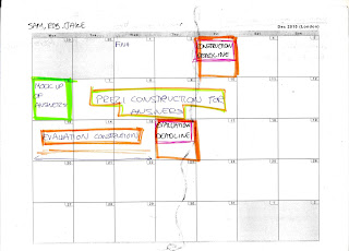
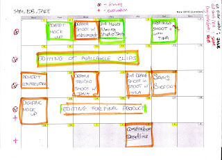
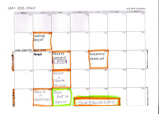
SA - Video Progress and Timeline


JD - Looking at a Music Video
We were advised to look back at music videos again so that we didn't get lost in the editing and footage of our own videos. Looking at other music videos from our genre would help us to see again what a music video from our genre should look like.
I chose this video as it really shows the grimey side to drum and bass and almost shows the roots of drum and bass as it was formed in a very 'underground' environment in terms of music. The use of the slow motion and flour in this video is something that we were actually planning on doing and shows how effective it would have been, but we ended up deciding to not do it as it would make too much of a mess in the locations we would do it.


