Tuesday, 30 November 2010
RB - Digipak so far...
JD - Rough Cut #2
I completed the second full length rough cut in the lesson yesterday. The studio shots of Tina really helped to bring the whole video together and gave more continuity to the whole video as it linked the shots of the instruments with the rest of the video.
We still have to film the flour shot for near the beginning of the video but are undecided whether or not to still do it. there are also still a couple of shots that aren't properly synced.
We were planning on getting some feedback yesterday, but uploading the video didn't go too well and are hoping to get this done today.
Feedback:
Did you enjoy the video and why?
Bright colours, use of pullback focus, fast cutting rate
Does it stand up to repeated viewings?
Yes, due to the fast cutting rate and interesting locations/colours
How is the genre of the track apparent through the video?
Colours, empty urban spaces, has an electro feel in a subtle way
How do you percieve the artist/band?
Edgy, alternative, British
Name one shot you liked and why.
Foot splashing, sky transition, red performance shots
Name one area that could be improved.
Less repeated shots, link girl and boy together, some syncing is out.
Thursday, 25 November 2010
SA - Video Progress and Timeline


JD - Looking at a Music Video
We were advised to look back at music videos again so that we didn't get lost in the editing and footage of our own videos. Looking at other music videos from our genre would help us to see again what a music video from our genre should look like.
I chose this video as it really shows the grimey side to drum and bass and almost shows the roots of drum and bass as it was formed in a very 'underground' environment in terms of music. The use of the slow motion and flour in this video is something that we were actually planning on doing and shows how effective it would have been, but we ended up deciding to not do it as it would make too much of a mess in the locations we would do it.
RB - contribution so far...
-Record smashing shoot.
-Helped edit the video after the first rough cut.
-Tested certain shots at home (speaker shots).
-Filmed the flour drop shot
-Filmed the flour on drum shot.
-Filmed the flame shot.
-Final Digi-pak prototype
JD - Completed Tasks
- 2 minute rough cut
- Hastings shoots
- Drama studio shoots:
+ Instruments
+ With Tina
- Speaker shots
- Other half page advert
- Took photographs for Digipak
Wednesday, 24 November 2010
RB - The record smashing shoot.
Tuesday, 23 November 2010
SA - Looking at a Music Video
- I looked around for a music video that broke with the normal conventions of a music video because our genre doesn't usually make music videos, although more are coming through nowadays.
- I found 'Power - Kanye West' and this is completely unconventional as a music video, it is a continuous slow pan outwards with extreme CGI and super slow-motion. It has Kanye west in the middle looking straight at the camera and there is rapping over the top but his mouth in the video never moves and neither does his body.
- The video is only 1:42 minutes long making it extremely short as a music video, also the super slow motion and high definition of the video makes it a really rich video to watch.
- Below is the video:
SA - My Completed Tasks in Production
- The Hastings Shoot
- The Drama Studio Shoots:
1. instruments
2. with Tina
- The Record Smash Shoot (at school)
- One of the half-page adverts for a magazine
- Co-edited with Jake
JD - Studio Shoot #2
- We used mainly red light to get the same feel as the shots with the intrumetns and it helped to link them together.
- We directed Tina, our singer, to show more emotion in her singing due to the feedback we got form our rough cut.
- When we first started shooting we were using only the red light at full power, but after a few shots we found that this created very stark shadows under the eyes, so we got Tina to move backwards so the light was more infront of her than above her. We also reduced the power of the red light and turned a white light on that was facing her to help eliminate the shadows.
- We could have tried to use different coloured lights rather than just red to give a variation through the video.
Monday, 22 November 2010
Tuesday, 16 November 2010
SA - Further Mag Advert Development and Final Advert


Here is the further development of my magazine advert for our music track.
Starting from the top left the progression goes across and down.
I have changed the font style and position, and added the song name. I also added both record labels to the bottom left of the advert to make it seem more professional, also I have added the websites of the bands and the main record label. These little details will make the advert more realistic and make it look like it could appear in a music magazine.
I have also turned up the contrast of the background so there are darker areas that create a more dramatic look to the advert, I felt the original image lacked a certain look.

RB - Mock Digipak write up.
Friday, 12 November 2010
JD - Rough Cut #1 (With Feedback)
Strong Points:
- Good Syncing
- Variety of shots
- Bright colour work well
Weaker Points:
- Loud points of vocals not carried over in performance
- Need a variey of close ups
- Camera movements need to be faster
- Not enough first person mode of address
Thursday, 11 November 2010
SA - Further Mag Advert Development
 - After looking at the way the first advert was panning out, I decided that it didn't really work , and there was too much difference in the band name and the re-mixers name. I also felt that the graffiti wasn't going to work very well.
- So I decided to make the advert a half page advert, that would still appear in 'Mixmag'.
- The measurements would now be 23cm wide and 15cm long.
SA - Mag Advert Development
 After the initial sketches I created the document on Photoshop, with the measurements on 23cm wide and 30cm long. I made a dark background and found the 'Chew Lips' graphic and cut it out, fitting it onto the white circle and then creating the 'Karen' text and picked the colour from the wood texture of the graphic.
I then used the 'extrude' filter on the 'chew lips' graphic, which created the block looking texture on the letters. I then added the 'Netsky' text and the graffiti photo at the bottom. I faded it the photo into the black background using the rubber tool and then moved the text so it was on the line of the join of the two sections.
Tuesday, 9 November 2010
SA - Rough Sketch for Advert
 This is a rough outline of an idea for my magazine advertisement that would appear in 'Mixmag'. I have used light trails as a main feature of the advert and the name of the original band, name of song and the remix artist.
The measurements of 'Mixmag' are 23cm wide and 30cm long, this sketch isn't to scale. When I create a mock up of the advert it will be the right size and there will be colours and more refined designs and font.
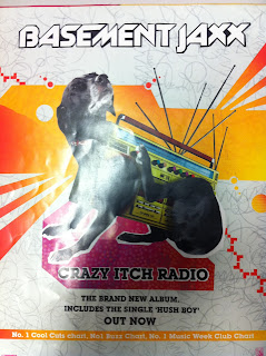
RB - Advert Analysis
 This is a print ad for the album 'Crazy Itch Radio' by Basement Jaxx. The reading path in this ad start with the eye being drawn to the fairly odd radio-dog and then, because you look where the dog is looking, you move up the the band name, Basement Jaxx. Then you jump down to the text underneath the image which is the album name 'Crazy Itch Radio' followed by the information about the album. This reading path lets the reader spend more time looking at the ad and taking in more information about it, whilst keeping it simple at the same time.
Monday, 8 November 2010
Feedback #7
JD - Studio Shoot #1
- We were able to experiment with the lighting to get exactly what we wanted. The shoot went well and the few shots that we managed to get into the edit and sync looked good and fitted in well.
- We may do another shoot in the drama studio with a dslr to get some more depth of field based shots.
- When we were playing the snare niether of us play the drums, so it took a while to get the beat right.
- When we were shooting there were points where I forgot about my shadow from the studio lights, so we had to repeat quite a lot of the shots.
JD - Hastings Shoot #2

- We found that the really high frame rates (240fps for example) began to loose quality, so we did the shots on 60fps and 240fps to see which come out best in the video.
- We didn't look at our story board at all during the shoot. This could have been because we went to Hastings the week before to practice and check the locations so we already knew what we were doing.
- After doing the shots we needed we explored Hastings a little further and found a new location next to the Childrens Library
- One of the locations we had chosen was infront of a garage, but when we first went there it was open with a car infornt of it so we had to go to a different location and hope that it was down when we went back, which luckily it was.
Friday, 5 November 2010
Feedback #5
I like the overall concept and feel - my comments are as follows:
1. It is all riding on a compelling performance from vocalist - make sure you clearly direct her and show her the animatic so that she has a sense of how close up the shots will be and can perform accordingly
2. I know the "slo-mo" style is a key part - however the track's beat really will demand a fast cutting rate in places. Particularly in opening 20 secs I think. Your animatic doesn't reflect that fast pased cutting rate - there definitely needs to be some montage sequences - think about the video with the birds eye of the decks.
Good luck this weekend _ I know JF was unexpectedly away on Friday; I hope you have all the equipment you need
Wednesday, 3 November 2010
SA - Deconstructing Print Media (Advertisement)
 This is a magazine advertisement that i found in 'Kerrang', although this is not the genre of music our track is associated with, i thought this advert suits the abstract/simplistic element of the track and original artist.
- The layout of the advert conforms to the Rule of Thirds with the band name covering the two top of points of the thirds. This draws your eye to the band name straight away and then your eye runs down the advert reading the album title and then the other information that is present on the advert, this reading path helps someone to take in all the information in a very short space of time.
- The first main linguistic sign is the band name, 'Kids in Glass Houses', helps us to identify the band, and can draw a fan to the advert. The second linguistic sign is the album name, 'Dirt'. This connotes teenage rebellion, nature and a sense of fun and youth.
- One of the iconic signs in the advert is the font of the band name, this is a block font that is coloured in a brown/red. It is a sans serif font with a slight eroded effect applied to it, this shows the band as being youthful and quirky as the font is quite unusual. The second iconic sign is the font of the album name, which has an ironic pattern applied to it. The flowery pattern on the word 'dirt' is an oxymoron and shows the band as quirky, and indie. Also the big, bold font adds to the overall look of the advert.
- Another iconic sign in the advert is the colours, which appear to be quite feminine with the pinks and light colours, however this style of graphic can now sometimes be associated with indie bands and the quirky/abstract look to band images. It shows the metro-sexual attitude towards males that can be represented with feminine iconography.
- The sum of all these signs creates the bands image to be one of indie/rock band. The font and colours of the advert represent the band as youthful, and not taking things too seriously. The flowers and light colours connote nature and the outdoors, yet the name of the band suggests something contrasting this. Although the band image would fit the random name they have, and this could be the reason for the quite avant garde design for the magazine advertisement.
- The ideological discourse present in the advertisement would most likely be youth and a feminine aspect. Although these ideologies are represented, the band's random image and name don't really match it, creating an overall band image of quite a random and indie feel. This also helps to explain the indexical signs that the audience would follow from this band. the audience would probably have the same avant garde and indie style that the band image shows.
Monday, 1 November 2010
SA - Researching Magazine Adverts in 'MixMag'
- After looking at the various music magazines that are popular today, I have come to the conclusion that our track would most probably be promoted in 'MixMag', which is "The Worlds Largest Dance Music and Clubbing Magazine". I think this style of magazine would suit our music track's electric/dnb genre and i can't see it fitting into any of the other popular music magazines.
- I bought the November issue of MixMag and flicked through to see some of the artist adverts, I found that a lot of them were for live shows. Some take up whole pages, whereas some are half pages or quarter pages. The bigger the artist the bigger the advertisement seems to be the key.
- The style of the advertisements in the magazine are quite simple designs with not too much of a busy pattern surrounding the text. In terms of text, it also seems to be quite simple.


