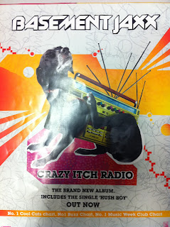
 This is a print ad for the album 'Crazy Itch Radio' by Basement Jaxx. The reading path in this ad start with the eye being drawn to the fairly odd radio-dog and then, because you look where the dog is looking, you move up the the band name, Basement Jaxx. Then you jump down to the text underneath the image which is the album name 'Crazy Itch Radio' followed by the information about the album. This reading path lets the reader spend more time looking at the ad and taking in more information about it, whilst keeping it simple at the same time.
The main linguistic sign in this advert is the band name, 'Basement Jaxx'. This helps us to identify the band and allows fans of the band to instantly recognise what the ad is about. The second linguistic sign is the album name 'Crazy Itch Radio' which in a way lets the reader get an idea of what type of music it is (alternative pop)
and is also connected to the main image of the ad. This title also constructs the band image as quirky and alternative.
Iconic signs in this advert are the font of the band name. It is futuristic looking which relates to the bands electro/dance subgenre. This helps create the bands image and will help people looking at the advert establish the thype of music the band create, in a short period of time. A second iconic sign is the font of the album name, its it quite generic but at the same time feels different to normal basic fonts, this could connote the bands sound is different but in some way feels like you know what to expect.
Another iconic sign is the colours of the ad. They are very bright and flourescent which could connote the bands electro/dance subgenre once again.
These signs help to construct the bands image by showing thier alternative/electronic/pop sound and signifies a youthful feel with the use of bright colours and quirky/random images.

i like that advert....the bright colours and abstract shapes is something i think we should include in our adverts
ReplyDeleteI agree- this would be a very interesting style to explore and relatively doable in Photoshop.
ReplyDelete